Delicate Whispers Cardmaking Ideas: How to Recreate the New Hydrangea Hue Before It’s Released
This week’s Thursday Live was such a fun one. I had the brand new Stampin Up Delicate Whispers Bundle on my desk, and once I started playing, I couldn’t stop.
This suite is elegant, detailed, and beautifully coordinated. Think soft florals, bronze specialty paper, rich Secret Sea, Mossy Meadow, Crumb Cake, and a stunning new blue-based purple that is coming soon: Hydrangea Hue.
And here’s the exciting part… we don’t even have the ink or cardstock for that colour yet.
So I figured out how to make my own.
Stampin Up Delicate Whispers Bundle and Delicate Dreams Specialty Paper
The Delicate Whispers Suite includes:
- A floral stamp set with elegant sentiments like “Thank You Kindly” and “Wishing You Happiness and Love”
- Coordinating dies that cut the main floral images plus delicate filler elements
- Stunning Delicate Dreams Designer Series Paper with bronze foil detailing
- Delicate Designs Designer Series Paper for even more bronze goodness
- Natural Matte Dots
- Gray Granite Ribbon
The bronze foil detailing in the paper instantly elevates any card. It gives that high-end, layered look without needing to add lots of embellishments.
But the real challenge for this project was colour matching.
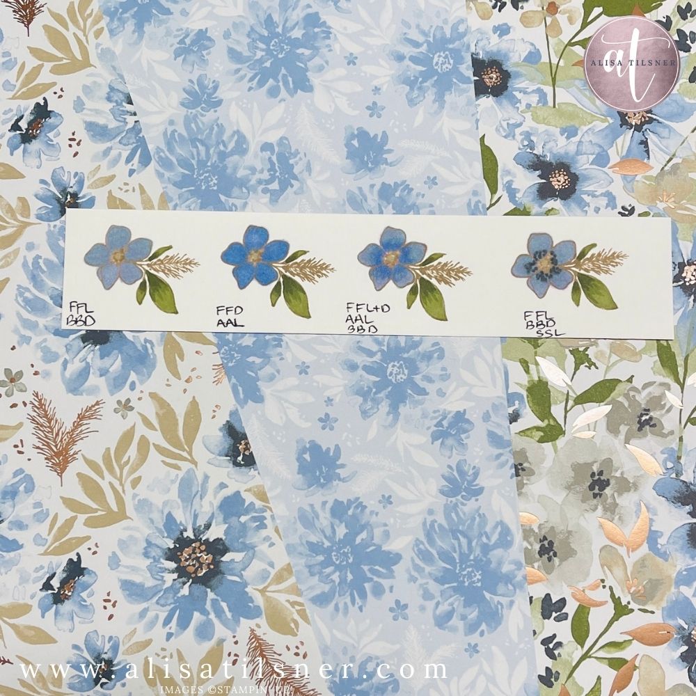
How to Recreate Hydrangea Hue with Stampin’ Blends
Because we don’t yet have Hydrangea Hue in ink pads, cardstock or Stampin’ Blends, I experimented with layering colours to create a close match.
Here’s what worked best:
- Light Fresh Freesia (full coverage base)
- Dark Balmy Blue (two layers over the top)
Order matters.
If you apply the blue first and then the purple, it reads too purple. By laying down Fresh Freesia first and then layering Balmy Blue on top, the colour reads more blue-based, which better reflects the Hydrangea Hue tone in the paper.
You must colour solidly. Fading into white will show streaks and uneven layering. The magic happens when both alcohol inks blend fully together and dry.
It’s not a perfect match, but it is absolutely workable, especially once layered with the coordinating Designer Series Paper.
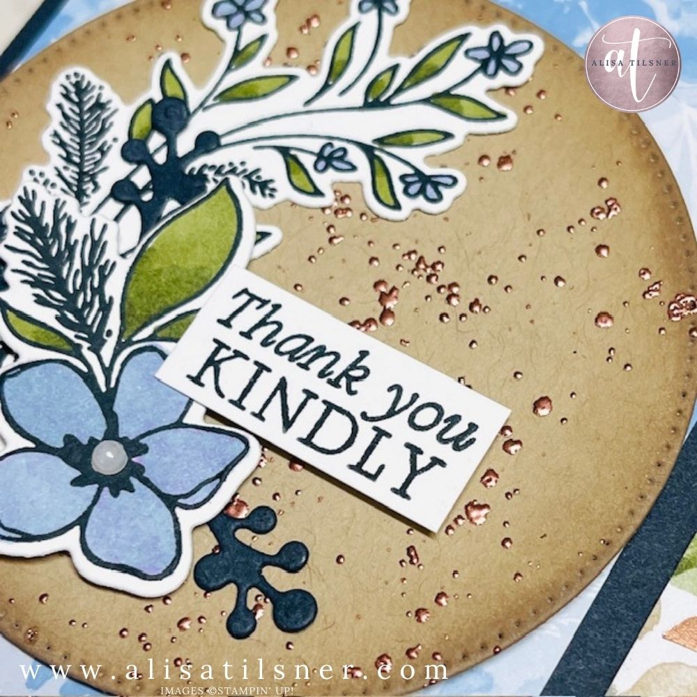
Elevating the Background with Copper Embossing
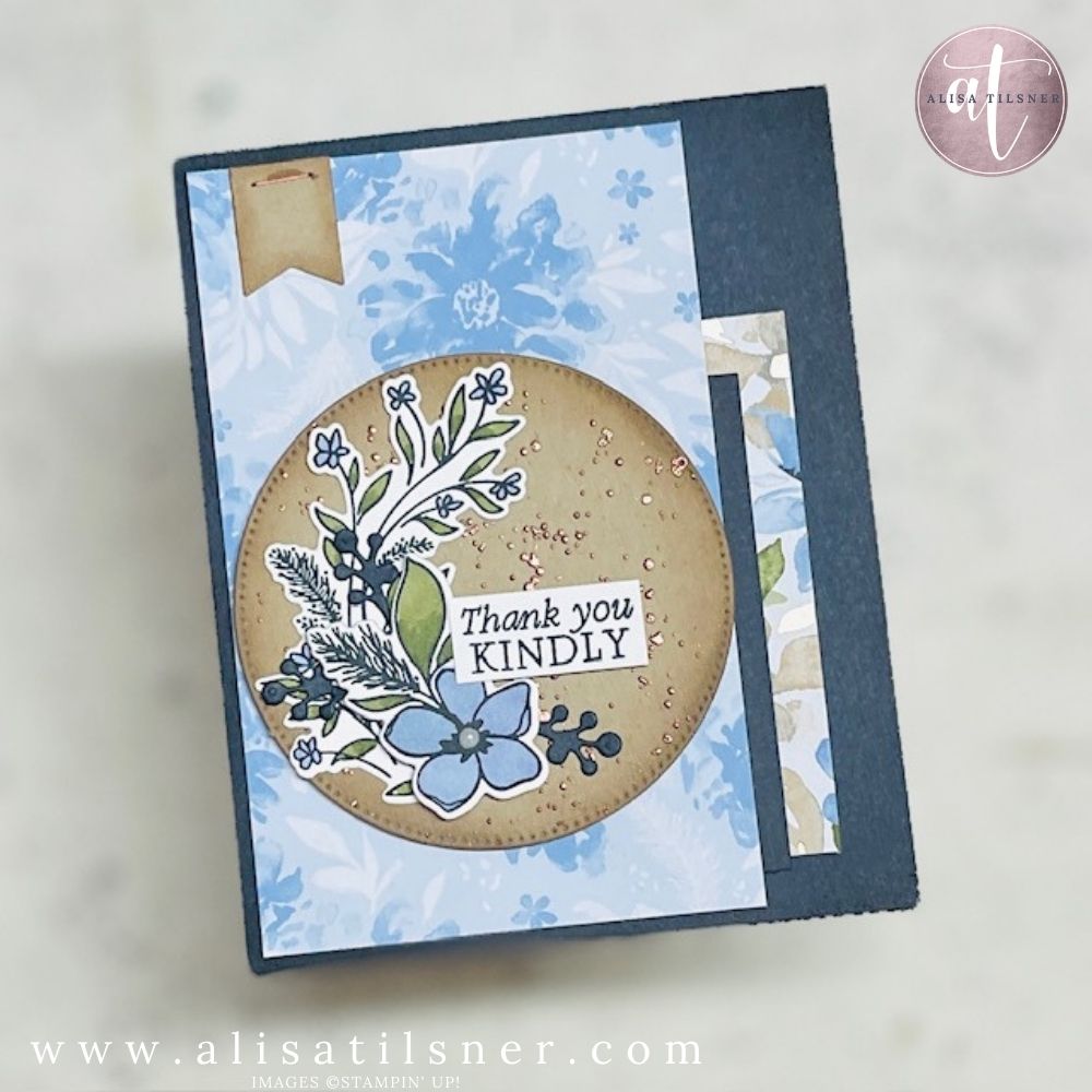
To tie in the bronze foil from the Designer Series Paper, I added a subtle background detail using a simple technique:
- Water down Multipurpose Liquid Glue.
- Flick it onto the Crumb Cake circle.
- Allow it to go slightly tacky.
- Add Copper Embossing Powder.
- Heat set.
The result is a speckled, metallic background that coordinates beautifully with the specialty paper. Because the glue is diluted, you get organic splatters rather than heavy blobs, and once heat embossed, it creates texture without bulk.
This is a brilliant way to “juj up” a simple focal panel.
Layering and Finishing Details
The finished card features:
- Secret Sea card base
- A strip of bronze-accented Designer Series Paper
- Ink-blended edging for depth
- Die-cut filler foliage
- A coloured staple (yes, you can colour your staples with Stampin’ Blends)
- Iridescent pearls in the flower centre
Each element is subtle on its own, but together they create a balanced, elegant design.
Why the Delicate Whispers Suite Is Worth It
If you love coordinated crafting, this suite makes it easy. The dies cut directly from the paper, the colour palette feels fresh but sophisticated, and the bronze detailing instantly makes your projects feel special.
If you’d like the full written instructions (with measurements in inches and centimetres), make sure you’re signed up to my newsletter. This tutorial will be added to the Freebie Library, along with over 160 other cardmaking PDFs.
Delicate Whispers is one of those suites that feels classic but current. And if you’re as obsessed with that new Hydrangea Hue as I am, now you know how to start using it before it officially arrives.
Cheers for Now
- Shop my ONLINE STORE
- Join The Artful Stampers Team – Happy Shoppers,
Hobbiest , Part Time and Full Time welcome! - Creative Card Makers Club
- Watch me on YouTube
- Socialise with me on FaceBook
- Email Me