Watercolour Cardmaking with the Flowers Fair Stamp Set
This week’s card was created for the Colour Inkspiration Challenge #206, and I have to say… this colour combo is such a good one.
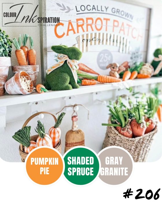
Pumpkin Pie, Shaded Spruce, and Gray Granite — it’s fresh, slightly earthy, and works beautifully for florals without feeling too soft or washed out.
I also ended up creating this card during my Thursday Live, and we turned it into a bit of a relaxed watercolour class… which means I’ve got some really helpful tips to share with you if you’ve ever felt unsure about watercolouring.
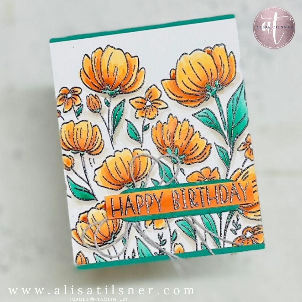
Why the Flowers Fair Stamp Set is Perfect for Watercolour
The Flowers Fair Stamp Set is one of those sets that does a lot of the work for you.
It’s sketchy. It’s loose. It’s not trying to be perfect.
Which means… you don’t have to be either.
During the live, I mentioned that this is the kind of stamp set that you can:
- Use as a full background
- Cut apart and use individual flowers
- Keep simple or build up with lots of detail
And honestly, I think this one is going to be a bit of a favourite.
The Key Technique: Emboss First (Trust Me on This)
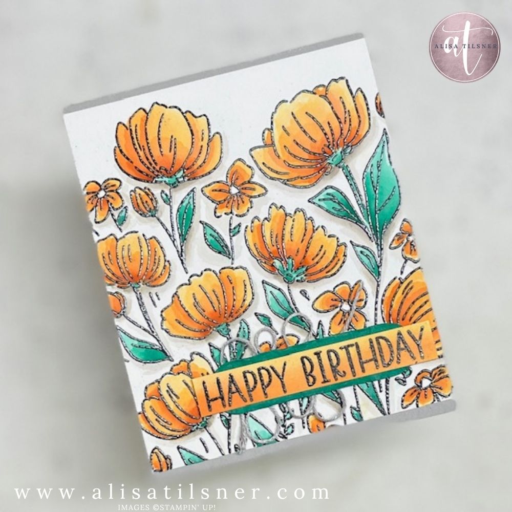
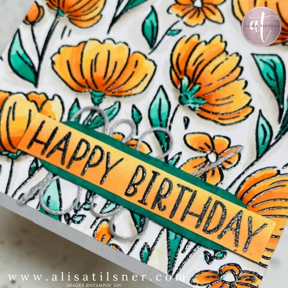
I stamped the full image in Versamark and heat embossed it in black onto Fluid Watercolour Paper.
And this step is everything.
If you’re new to watercolouring, embossing is your best friend because:
- It helps contain the water
- Stops colours from bleeding everywhere
- Gives you cleaner, more controlled results
I actually stamped this three times with Versamark to make sure I got a really solid, even coverage on the textured watercolour paper — and that makes a big difference in the final result.
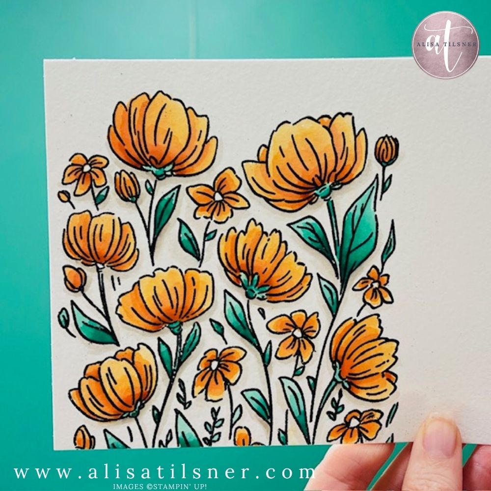
This is where the magic happens… and also where people tend to overcomplicate things.
Here’s what I walked through during the live:
1. Control Your Water (This is the Big One)
Water control is everything.
- Too wet ? puddles and harsh lines
- Too dry ? colour won’t move
What you’re aiming for is a brush that’s slightly damp — just enough to move the ink without flooding it.
2. Work in Sections (Not All Over the Card)
One of the biggest tips I shared:
? Work down the card — not randomly all over it
Because otherwise… you’ll stick your finger in wet ink and transfer it everywhere (ask me how I know).
3. Build Colour in Layers
For this card, I used:
- Shaded Spruce for leaves (light wash ? darker shading)
- Pumpkin Pie for flowers (up to 3 layers for depth)
Instead of going in dark straight away, build it up:
- First pass: light wash
- Second pass: add depth
- Third pass: focus on shadow areas
You can get so much variation from just one ink colour doing this.
4. Add Depth Where It Naturally Occurs
For the flowers, I focused darker colour:
- Where petals overlap
- At the base near the centre
- Slightly up the petal (not all the way)
This creates that soft, dimensional look without needing multiple colours.
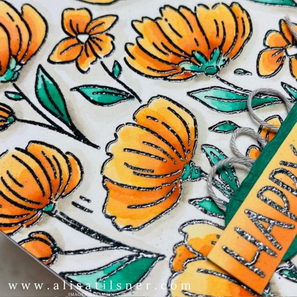
5. Don’t Skip the Shadow
This is what really finishes the card.
I used Gray Granite underneath:
- Flower heads
- Leaves
- Any area that would naturally sit “behind”
Keep it soft and slightly watery, then deepen it just under the edges.
This is what makes everything look like it’s lifting off the page instead of sitting flat.
Designing the Card
Even though the background is quite detailed, the rest of the card is actually really simple.
The full floral panel is trimmed to size and layered onto a Shaded Spruce or Gray Granite card base, which gives it a much richer, bolder look compared to a neutral base.
For the sentiment:
- “Happy Birthday” (2026 Virtual Card Making Retreat)
- Black heat embossed
- Washed over with Pumpkin Pie
Behind that:
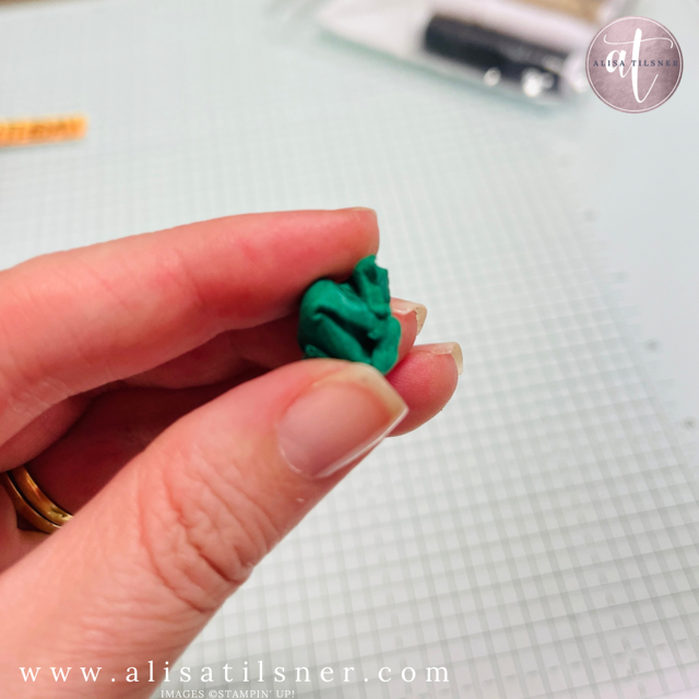
- Label die-cut using Lovely Blossoms Dies
- Scrunched for texture (don’t skip this — it makes a difference)
- Gray Granite Baker’s Twine looped behind
- Popped up with Dimensionals
Why You’ll Love This Technique
This is one of those techniques that:
- Looks far more advanced than it is
- Is incredibly forgiving
- Gives you a really artistic finish
And as I said during the live… we can be our own worst critics.
But the person receiving your card?
They’re just going to see something beautiful and handmade.
Final Thoughts on Colour Inkspiration #206
This colour combo is such a standout.
Pumpkin Pie + Shaded Spruce + Gray Granite gives you:
- Warmth
- Contrast
- Depth
It’s perfect for florals, but you could easily adapt it for other styles as well.
If you’re playing along with the challenge, I’d love to see what you create.
And if you’ve been unsure about watercolouring… this is absolutely the place to start.
Cheers for now

- Shop my ONLINE STORE
- Join The Artful Stampers Team – Happy Shoppers,
Hobbiest , Part Time and Full Time welcome! - Creative Card Makers Club
- Watch me on YouTube
- Socialise with me on FaceBook
- Email Me