Clean & Simple Shelf Card with the Stampin’ Up! On Display Bundle
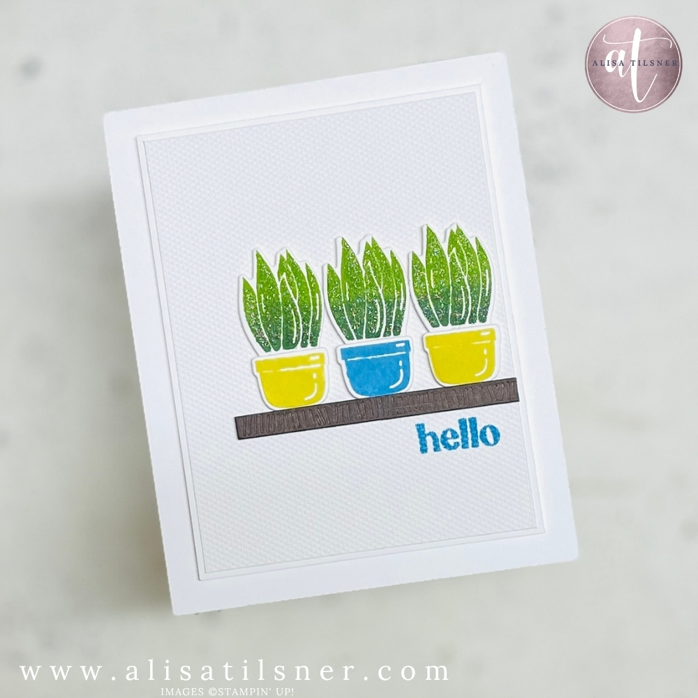
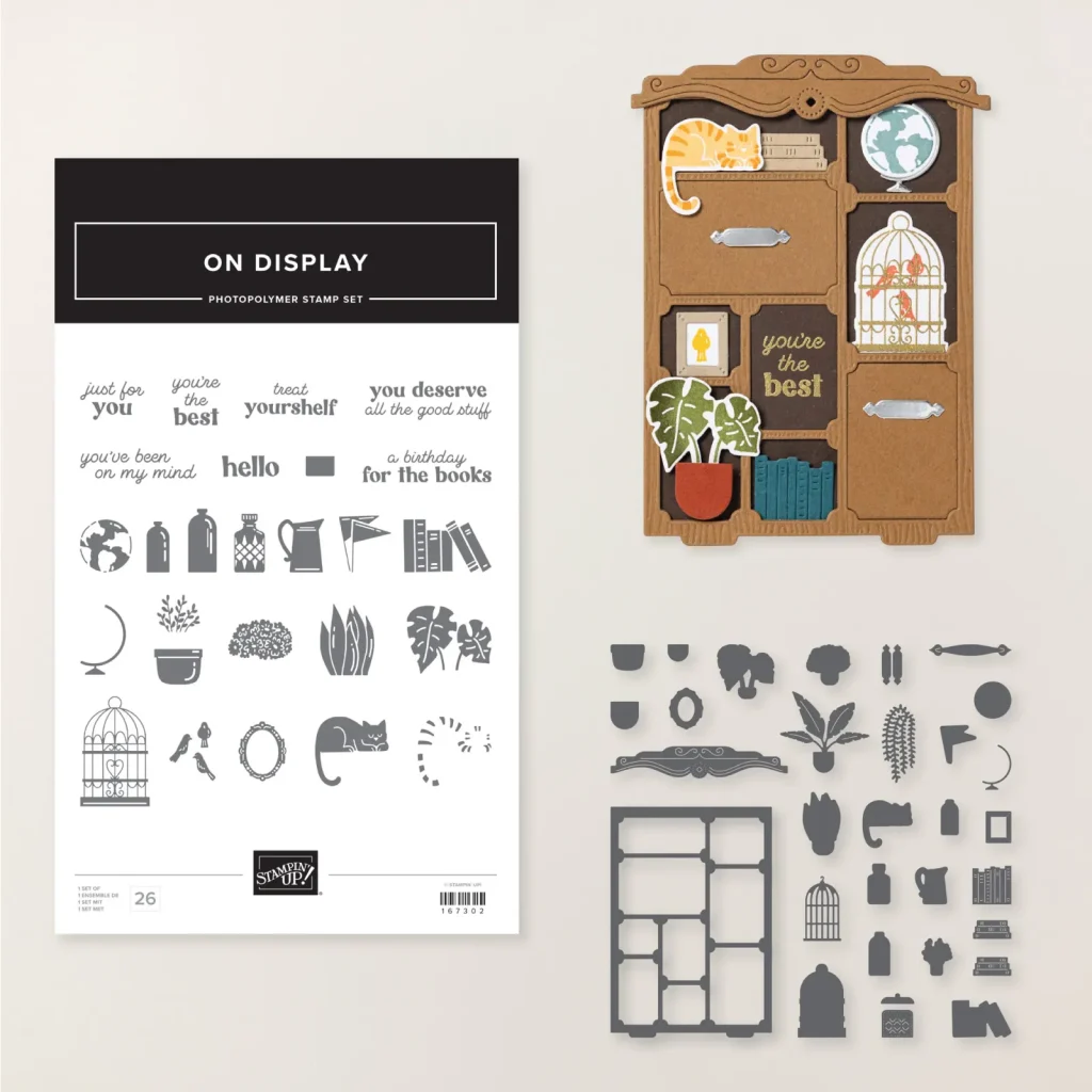
If you love the look of clean, modern home décor, you are going to adore the Stampin Up On Display Bundle. In this week’s Thursday Live I created a clean and simple (CAS) plant shelf card using the On Display stamps and dies – and it has quickly become one of my favourites. Today I’m sharing the card, the techniques I used, plus a handy tip for storing your new photopolymer stamp sets.
What is a Clean & Simple (CAS) Card?
A clean and simple card focuses on:
- Lots of white space
- A simple focal point
- Minimal layers and embellishments
- Quick, repeatable design
For this card, I kept everything crisp and white, then let the shelf, plants and sentiment be the heroes. It is a great style if you need something you can recreate quickly, but still want it to look polished and intentional.
Stamp Storage Tip for the New Packaging
Before we even started stamping, I shared a little organisational trick for the new-style photopolymer packaging – especially handy for big sets like On Display (26 stamps and 30 dies is a lot to keep track of!).
Here’s what I did:
- Adhere the image sheet
- Open the case and add Tear & Tape to the firm acetate side (not the softer plastic cover).
- Stick that firmly inside the case so it doesn’t move.
- Stamp the whole sheet once
- Ink up all the images on the carrier sheet in a neutral ink (I used Gray Granite).
- Close the cover and rub over the top to transfer the images to the inside of the case.
- Use it as a placement guide
- Clean the stamps and, after using them, just pop each one back directly over its stamped image.
- Close the case and press so they all “grab” back onto the acetate.
This way you can see at a glance if any stamps are missing, and it is brilliant for bigger, more detailed sets like the Stampin Up On Display Bundle.
Building the Plant Shelf Focal Panel
Two-Tone Snake Plant (Mother-in-Law’s Tongue)
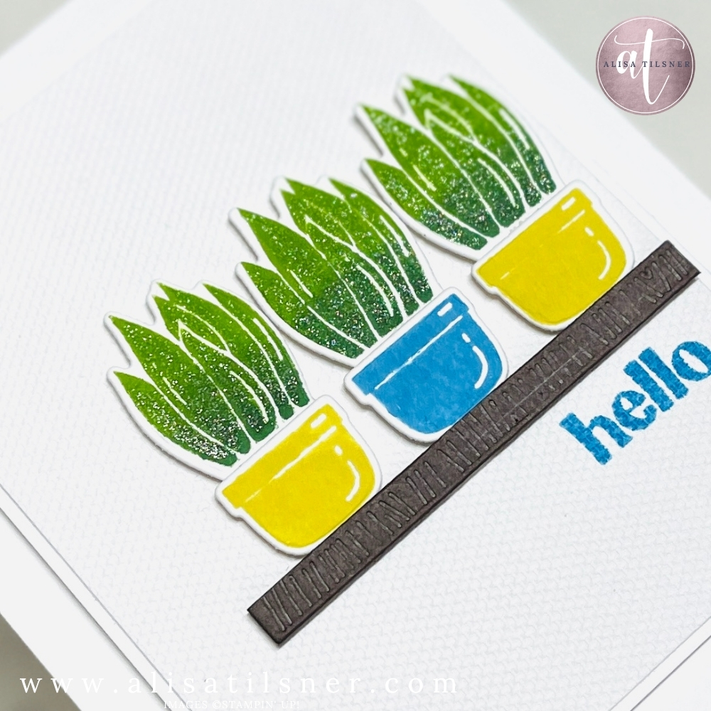
For the plants, I used the tall leafy image – it reminds me of a snake plant:
- Stamp three plants on a strip of Basic White using Garden Green and Granny Apple Green.
- Ink the bottom half of the stamp in Garden Green and the top half in Granny Apple Green.
- There will be a visible line where the colours meet, so use a small sponge or dauber to very gently blend the darker green up into the lighter before stamping.
- Stamp three images, leaving room for the die tabs at the bottom.
This gives a lovely ombré effect from deep green at the base to fresher green at the top – perfect for leafy foliage.
Colouring the Pots
The pots were stamped in warm yellows for contrast:
- Crushed Curry as the main colour
- A little Darling Duckling sponged around the edges for extra depth
I also created a bright Azure Afternoon pot for a pop of blue. It ties in beautifully with the greens and gives that modern “ceramic pot” look you see in homewares stores.
Die cut all the plants and pots, making sure to line up the tab on the plant dies so it tucks neatly behind the pot when you glue them together.
Creating the Shelf and Layers
To keep the card clean but interesting, I used texture rather than patterned paper:
- Card base: Basic White
- Textured panel: A piece of Whispers of Texture (the cross-hatch pattern) trimmed down as a smaller panel.
- Double white matting: I layered that textured piece onto another thin white panel before adding it to the card base. The tone-on-tone layers add structure and make the texture really stand out without adding visual clutter.
For the shelf, I die cut a strip from Early Espresso card using BookCase die that adds a subtle woodgrain-style texture. This is much more interesting than a plain cut strip and still keeps the overall design very simple.
I adhered the shelf using dimensionals, positioning it roughly along the lower third of the card front – using the rule of thirds helps keep the design visually balanced.
Then I mounted the three potted plants in a row along the shelf with dimensionals for extra depth.
Finishing Touches: Sentiment & Subtle Sparkle
The sentiment is a small “hello” from the On Display set. To keep the CAS feel:
- I stamped “hello” directly onto the textured panel in Azure Afternoon after testing it on a scrap first.
- Stamping on the textured card gives a lovely, soft, slightly dotted look that suits the relaxed home décor vibe.
Because I wanted to stay true to the clean and simple style, I skipped bulky embellishments. Instead, I added a light wash of Wink of Stella to the plants and pots – just enough shimmer to catch the light without cluttering the design.
Why You’ll Love the Stampin Up On Display Bundle
The Stampin Up On Display Bundle is incredibly versatile:
- Build shelves, bookcases and décor vignettes
- Mix stamped images and standalone dies for endless combinations
- Perfect for clean and simple cards, masculine cards, home-themed projects and more
If you’d like the full measurements and step-by-step instructions for this card, make sure you are on my email list – this project will be added to my Freebie Library, which already holds over 150 card tutorials you can access any time.
Cheers for now

- Shop my ONLINE STORE
- Join The Artful Stampers Team – Happy Shoppers,
Hobbiest , Part Time and Full Time welcome! - Creative Card Makers Club
- Watch me on YouTube
- Socialise with me on FaceBook
- Email Me